Pettibone Gothic
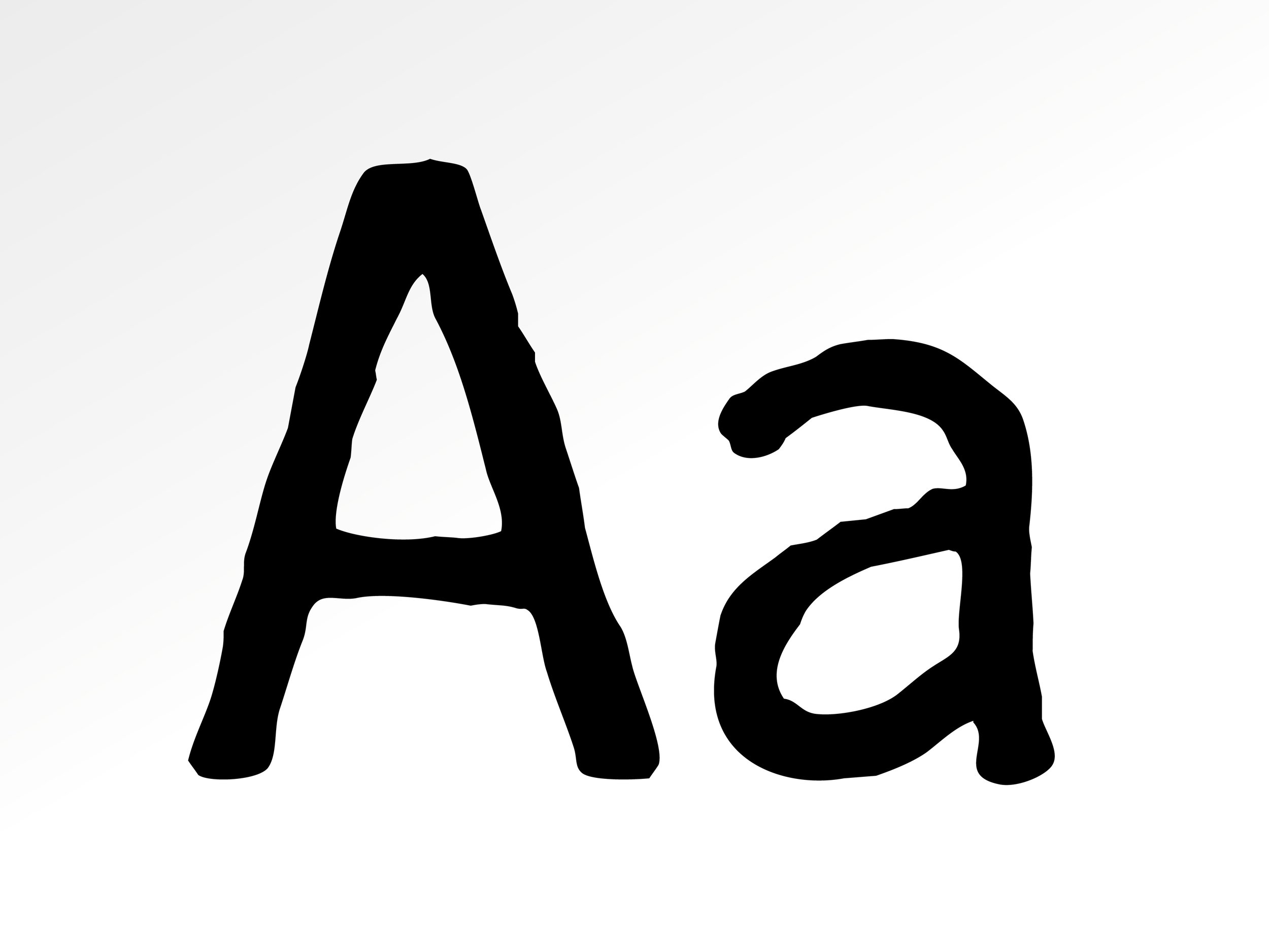
This typeface was created for the book Richard Pettibone: A Retrospective. The artist is best know for his diminutive reproductions of famous works of art. Heavy Meta focused on Pettibone’s renditions of Artforum, basing the book on the magazine’s grid. Heavy Meta then commissioned a ‘translated’ version of the magazine’s typeface, Trade Gothic, in which to set the book. The imperfect quality of the letterforms complements Pettibone’s small, hand-made reproductions of the magazine spreads themselves. When typeset, the irregularity recedes, giving a warm texture to the block of copy.
Work on Pettibone Gothic included illustration and typographic design.
March 2005 for Heavy Meta Design


© Amanda Bowers Wong 2026